Review | The Smooth and the Striated: Otto Berchem & Rachel Hellerich
Review | The Smooth and the Striated: Otto Berchem & Rachel Hellerich
Melanie Carr Gallery
Melaniecarrgallery.com
Through August 25
Melanie Carr Gallery, Essex, CT. July 2019. Photo Courtesy of Rachel Hellerich.
What interests us in operations of striation and smoothing are precisely the passages or combinations: how the forces at work within space continually striate it, and how in the course of its striation it develops other forces and emits new smooth spaces.
— Gilles Deleuze
In the center of the gallery, an easel holds Otto Berchem’s work, In the Beginning Was the Sea (2019). A black and white photograph of the ocean has been partially covered by a wave of semi-circular dabs of paint that travels across the middle of the composition. With its oceanic imagery, this piece opens the two-person exhibition, The Smooth and the Striated: Otto Berchem & Rachel Hellerich, in which both artists share a connection to the Connecticut shoreline. Berchem, now based in Bogota, was born in 1967 in Milford, CT, where Hellerich now resides.
The show’s title is taken from a chapter of Deleuze and Gattari’s text A Thousand Plateaus (1980), in which the authors explore the sea as a vast spatial field. The sea is the epitome of smoothness, but it also vacillates between both qualities. Smooth spaces continue without end, whereas a striated space has ridges or plateaus. As with the ocean, the smooth and striated most often exist together, as they do in this show.
To the right of the easel, four of Berchem’s works—similar to the aforementioned piece, but at an enlarged scale—arc across the wall. Their titles include allusions to the sea: The Colors of the Sea, When I See the Sea, Why Do the Waves Ask Me, and A Desert of Waves. This unconventional hanging mimics the half-circles undulating over the underlying images, with some compositions becoming more covered than others. The patterns seem to mimic the flow of water, but Berchem’s tidy spectrum of mostly warm colors—cadmium yellow, quinacridone magenta, burnt sienna, to name a few—separates from the cool imagery of the water’s surface.
Installation view of The Smooth & the Striated. Photo: R. Hellerich.
The set-up of these pieces recalls a similar strategy employed by the California Conceptual artist John Baldessari (b. 1931). During the 1980s, Baldessari began placing brightly-colored price stickers over the faces within black and white photographs. The stickers stood out because of their hues—lemon yellow, fire engine red, lime green, or sometimes pure black—and because the part of the image that many value the most—namely, the face—had been obscured. In a similar fashion, the serene and tumultuous beauty of the water is withheld from view in Berchem’s series.
Other works by Bercham such as Pausas I and Frente Al Mar (Stanza III)—both from this year—include the same system of patterned half circles, but in lieu of any imagery, these elements float on the surface of unprimed canvas. Faint ridges along the edges of these shapes bring to mind the idea of striation and they seem to indicate Bercham carefully taped off each smooth shape, varying his colors but adopting the same reduced palette as the other works. While streaking is visible in the other works, here, his application of the opaque acrylic paint is pristine. Appreciation for the formal elegance of these works is easy to muster. These works also taunt viewers to tease apart their internal order.
Installation view of The Smooth & the Striated. Photo: R. Hellerich.
Like Bercham, Hellerich’s palette is consistent. In particular, purple—the color of royalty and magic—becomes a central hue to many of her compositions. Alongside purple, Hellerich often combines the soothing colors of a sunset: pastel yellow, rose pink, and soft teal. Some paintings summon the world of Jem and the Holograms, a cartoon from the 1980s, or the dreamy but dark fairy-tale scenery of a Disney movie such as Sleeping Beauty (1959). As a whole, her colors feel majestic. Never muddy nor bizarre, these colors entice.
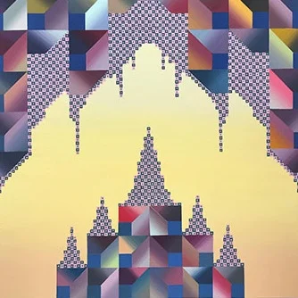
The strongest work in the show occurs when this romantic color world matches the aura of the imagery in Hellerich’s Temple series, resulting from a recent trip to Thailand and Cambodia. In this series, Hellerich’s stark symmetry engenders the notion of smoothness that gets interrupted with her patterning, a striking form of striation within the spatial construction of the paintings.
Rachel Hellerich, Ceremonial Light (2019). Acrylic and flashe on panel, 12 by 16 inches.
In an almost hidden corner of the gallery, Ceremonial Light (2019) feels larger than its petite panel of 12 by 16 inches. The shimmery gold background appears to open to an infinite space, while in the foreground, Hellerich plays with spatial relationships by shifting the scales of her patterns. From the flat spread of minuscule dots to the recurrence of blue squares within larger squares broken by gradients of varying hues, Hellerich makes references to Op Artists such as the Hungarian-French artist Victor Vaserely (1906–1907). The sense of space within this scene becomes fugitive, yet it’s clearly a landscape, a genre Hellerich explores throughout this show. There’s no direct indication of water, but it somehow seems to be present. This painting carries the sensation of an astral projection—slipping beyond one’s physicality into a spiritual realm.
Both Hellerich and Berchem use the ocean as a springboard for many of the works in The Smooth and the Striated. Some connect to this imagery more directly than others, but all seem to employ idiosyncratic systems devised by the artists to interrupt conventional conceptions of spatial order. Berchem’s milieu is cerebral—rewardingly so—while Hellerich, at her best, coaxes viewers into a spooky dimension.


